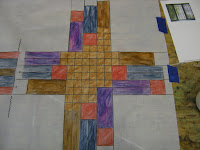
I have lost the color pattern for this line drawing. The center is plum flanked with the deeper brown and the larger rectangles are blue

This line drawing has a mosaic in the center...this one represents the one I like best for using all the colors
Keeping the tone to a more neutral palette with pops of the other color
 choices
Here is another example...
with the color...

The furnishings they chose are mission in style so I thought that using Frank Lloyd Wright for my inspiration in designs might look nice for the cross...
Keep in mind the colors I have represented do not need to be placed as I have them, nor do all of them need to be used...
This gets decided in the next meeting with clients..
Somewhere has to begin the process of elimination and with out a few examples we can't decide what we might like better or not at all...
I will keep you posted
2 comments:
I like the Frank Lloyd Wright inspired cross very much. I was so impressed with all the problems you faced, how you showed us the obstacles connected to each, and how you tackled them. A truly inspiring and eye opening post.
Hi, Mar! More beautiful designs! Great stuff! :-)
Post a Comment